On the go? Listen to a voice recording:
Reading time: 10 minutes
Published: 2023 | Author: Ian Conceicao
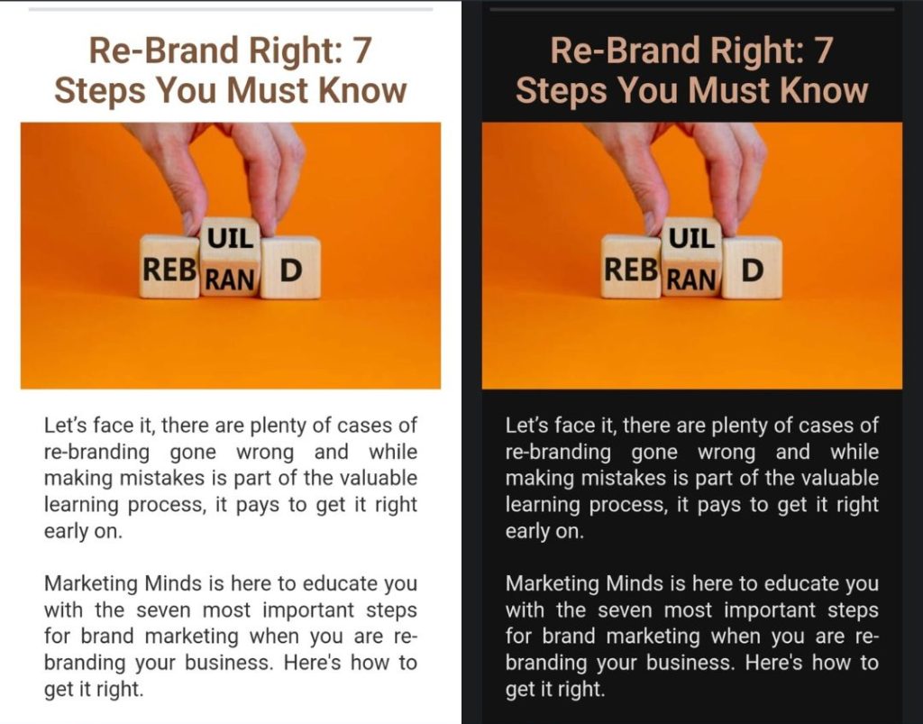
Like the recent pandemic, Dark Mode has swept the globe after it was launched on Apple phones in 2018, and its popularity continues to grow rapidly among users on their smartphones, laptops and social media platforms
Recent surveys* show that 81.9% of Smartphone users prefer using dark mode on their apps and over 80% of users have switched to Dark Mode on their devices. Unlike traditional interface settings with dark elements on a white or pale background, Dark Mode displays light-coloured text and content in high contrast on a dark background, which makes it easier on the eyes and more visually appealing with its sleek and modern look.
Many users are already familiar with dark mode and expect to have the option to toggle between the light and dark interfaces. Many websites and apps provide a choice between light and dark, so users can determine what meets their needs better. In fact, tech giants including Google, Apple, Android, Microsoft and Facebook have already paved the way for a new wave of visual features and more companies are joining them.
Why is Dark Mode so popular?
Dark Mode is attractive because it allows users to personalise their digital environment to reflect their individuality with a modern design aesthetic that makes the experience different and exciting.
With longer amounts of time we spend on screen-based devices, Dark Mode is also popular because it improves viewer comfort by reducing screen flicker, glare and blue light. By enhancing readability and relieving eye strain, the darker screens enable users to work, study or browse for longer periods comfortably, in low-light environments. Furthermore, it extends the life of the battery of older phones!
Dark Mode can be enabled on a device through an app UI or operating system.
So, what does this mean for Digital Marketing agencies and Digital Marketing Consultants like us?
As a digital marketing agency, the delivery on our marketing strategies is only as good as the effectiveness of the implementation. As such, adapting marketing design for Dark Mode is critical especially when data shows that adoption of dark mode is highly preferred and here to stay. A key challenge however, is that most digital marketing design and content are created on desktops and most marketing software does not provide the functionality to toggle between the standard appearance and dark mode.
Furthermore, less than ideal design in Dark Mode can impact the first and lasting impression of a user to your digital platform, whether it is a website or e-newsletter. Even worse, your logo or image may blend into the background and become invisible. This is not the brand experience you want to be known for!
Also, many digital marketing agencies in NZ are not aware of Dark Mode’s high adoption rate and as a result, are not optimising content for Dark Mode. This leads to many websites and email marketing designs falling short of delivering on a marketing strategy.
Designing for Dark Mode is further complicated by the fact that there is no standardised way that Operating Systems convert light mode to dark mode. For example, an e-newsletter in Gmail may be fully inverted from light to dark mode but only partially in Outlook and some Windows and Android platforms, as demonstrated in the images below.
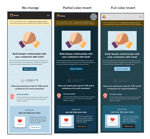
Image source: A Beginner’s Guide to Optimizing Imagery for Dark Mode Emails – Litmus
Optimising Digital Marketing Design and Content for Dark Mode
Here is a guide for optimising digital marketing design for Dark Mode:
1. Use transparent backgrounds
The most important design element to remember is that the background colour will switch to black and if your logo is not on a transparent background, it will appear as shown below.
On light mode background:

On dark mode background:
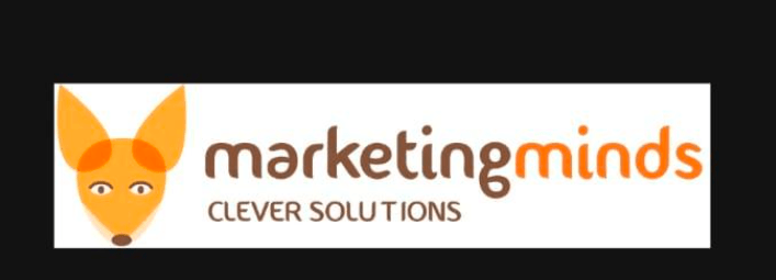
Also, in Dark Mode, if the image backgrounds are different sizes, it will appear untidy. So it’s best to ensure they are the same size or as mentioned above, have it as transparent background.

To avoid this, use images with transparent backgrounds. Eg.

In this instance, our Marketing Minds logo appears fine once we made the background transparent.
2. Add a thin white border or translucent glow around icons and logos to improve readability.
However, if your logo or icons are not legible or visible, here are a few other possibilities to help make it work.
Once the background is transparent, add in a thin white border, shadow or light stroke around it to improve readability. In light mode, users will not see the white border, but in dark mode, they will be able to see your logo and social icons more clearly.
Here’s an example with a thin white border:

This is the Marketing Minds logo with a white glow.

It really is a matter of testing your design in dark mode to decide what will work best for you.
3. Use a shape outline or background
For stroke-based icons and illustrations, consider adding a shape outline or background shapes behind them for a more visually appealing look.
Eg. adding a background shape to your icons for dark mode.

Image source: A Beginner’s Guide to Optimizing Imagery for Dark Mode Emails – Litmus
4. Avoid extremes in Dark and Light and design with midtones
Too much contrast makes content difficult to see and strains the users’ eyes. Use shades of light grey and pastel colours instead of solid black and white.
One approach is to focus on midtones, while accounting for accessible contrast ratios.
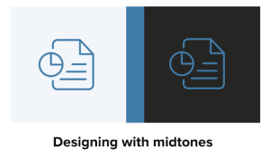
When designing with midtones, use a colour that has a high enough colour contrast for both white and black because it falls toward the middle of the value range.
5. Instead of GIFs, use APNGs
GIFs at times don’t support transparency as well. Eg. the pixelated edges of our logo in GIF as per below.

Instead try using Animated Portable Network Graphics (APNGs) to add animation to your design element.
While white outlines can become pixelated due to a limited colour range, APNGs generally support transparency and have a wider colour range and higher resolution.
6. Adjust your colour saturation levels or create layers of colours
- Keep saturation levels on the lower end of the scale. Colours tend to stand out more on a dark background and if they are over-saturated, they will appear to vibrate and make reading difficult.
- Create layers of colours – with lighter hues in front
-
- The higher a layer is, the lighter it should be. This will create a visual hierarchy in dark mode that goes from the most used elements in your display to the least.
-
7. When in doubt use text
To ensure your message comes through on dark mode, opt for using text rather than images of text. This will not only render better in dark mode but may also improve your deliverability and accessibility. To make your emails more accessible make sure you add ‘alt text’ to all your images too.
Also, text-only emails tend to have higher open and click rates. So, where a text-only email makes sense, consider using them.
8. Test! Refine and test more if in doubt!
- Experiment with both light and dark versions of your interface. Seek user feedback to determine which mode works best for your brand – then, carefully make any necessary refinements for an optimal viewing experience.
- You can also use tools such as Litmus which allows you to preview emails in both light and dark modes as well as to see how they will render in various desktop and mobile email platforms. Marketing Minds digital marketing consultants will be able to provide you with expert guidance on this.
As more and more apps and websites adopt Dark Mode, users will come to expect it as a standard offering. This trend provides new opportunities for businesses to market themselves and is likely to continue influencing user preferences and viewing habits. Whether you’re a designer, business owner, marketing professional or consumer, our digital marketing agency can help you explore the possibilities of Dark Mode and how it can enhance your experience of digital marketing design and content.
References:
The past, present, and future of Dark Mode | by Olivier Berni | UX Collective (uxdesign.cc)
How Many People Use Dark Mode in 2022? (Usage Statistics) – EarthWeb
Dark Mode in Email: Are your emails ready for the biggest trend? | Mailmunch
11 Tips for Dark UI Design – The Principles of Dark Mode UI | Halo-lab
Dark mode design: tips for creating dark theme websites and apps – 99designs
Dark mode template design best practices reference – Klaviyo – Help Center
A Beginner’s Guide to Optimizing Imagery for Dark Mode Emails – Litmus
Optimize your campaign for Dark Mode – ActiveCampaign Help Center
______________________________________________________________________________________
Your business could qualify for partial government grant with Marketing Minds Digital Marketing Success programme.
If you want some more personalised advice on reaching your marketing objectives, or if you have any other questions, call us at +64 9 6344 390, email info@marketingminds.me or contact us.
Enjoyed this article and want more? Sign up now to our marketing snippets!
If you’ve found this article useful, please share it with others.
